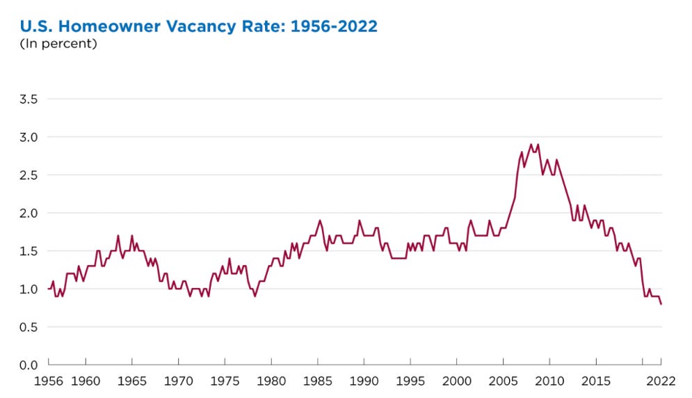
The increase in home prices over the past two years has been rapid but not shocking when considering the supply/demand set up heading into 2020. While new home starts were depressed for the decade following 2009, people didn’t stop getting married, having kids, forming households, and moving cities. Instead, the housing inventory that built up in the early 2000s was absorbed in the years following the crash and by 2019 we were left with a shortage of housing just as we were heading into the current home buying demand wave. After the homeowner vacancy rate spiked to nearly 3% in 2009, or ~4.2 million homes, it steadily dropped and now stands at just 0.8%, a historic low.1
This clash of supply and demand resulted in an imbalance which led to the bidding wars and skyrocketing home prices we’ve seen since 2020. While it’s been the result of basic economics and not rampant speculation, these price increases along with the more recent spike in mortgage rates have created affordability concerns.
Affordability has a clear effect on the feasibility of home ownership for many. The chart below shows home ownership rates vs estimated home ownership cost for the top MSAs (defined as over 1 million people) which captures nearly 60% of the US population. Home ownership cost here is estimated as the monthly mortgage + tax + insurance cost for the median listed home in an MSA as a percent of the 75th percentile household income within that MSA. With an r-squared of 45%, this affordability metric alone explains almost half the variance in the home ownership rate by MSA.
We like to use the median estimated home cost as a percent of the 75th household income because it is a closer representation of the true median home buyer. Too often, people cite median home price vs median income, and sometimes even more egregiously, do so on a national level. We believe this is an incredibly flawed way to view housing affordability for a few reasons.
First, the median US household is not the same as the median homebuyer. The median household income in the US is around $67,500. The median homebuyer income is over $100,000 with 76% of homebuyers earning more than $65,000. In other words, the median US household is not the one buying the median home so to compare those two as a metric for affordability is misleading. For example, the median homebuyer in Texas in 2021 had a household income of $107,500 which is equivalent to the 70th percentile household income in the state2. Second, incomes and home prices vary vastly by state and city, and as we’ll examine later, this distinction is more important than ever with the increased ability to work remotely.
I’ll also note that the income numbers we’re using are the most recently available at this level of granularity and are from early 2021 while the home prices we’re using are median listing prices February - April 2022, so in a way we’re assuming zero earnings growth since early 2021 which seems conservative.
Buy vs. Rent
People need somewhere to live and the choice most people have is to buy or rent. Among the factors that influence this decision are the need for more space for a family, the desire to have a yard, living in good school district, and of course, cost. The chart below illustrates the cost tradeoff specifically between renting and buying by MSA by comparing how much incremental income it would take to buy the median house vs rent the median 2-bedroom apartment for a household in the 75th percentile. Positive means more expensive to buy, negative means more expensive to rent.
On the left side of the graph there are cities like Austin, San Jose and Salt Lake City where it would cost an additional 12% - 15% of a the 75th percentile household’s income to buy the median house vs rent a 2-bedroom apartment in that city. On the right side, there are cities like Cleveland, Memphis, Miami, and Pittsburgh where it is actually cheaper to buy a home vs rent a comparable apartment.
As home prices have shot up over the past couple years, rents have as well, and the point of this exercise is to frame the decision millions of people are actively making. So, although it is more expensive to buy vs rent in most major cities, outside of the top few cities on the far left, it isn’t that much more expensive, especially when considering other factors important to people. Look at booming cities like Atlanta, Richmond, Charlotte, Phoenix and Raleigh. It’s not unreasonable to think that people in those cities or moving to those cities decide that having more space, a yard, being in a better school district and owning their own home is worth spending an additional 2% - 6% more of their current income vs renting an apartment. Especially when considering the attractiveness of locking in a fixed housing cost vs. being at the whim of future rent increases.
Rate Sensitivity Analysis
With the average 30-year fixed rate mortgage in the US now at 5.3% as of May 2022 many are getting nervous about overall housing affordability. Of course, as with all things housing, things need to be looked at granularly and locally.
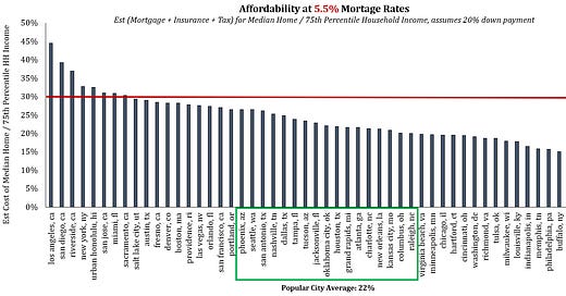
Below we look at affordability by MSA at various mortgage rate levels. For this exercise, we draw the “unaffordable” line at 30% of household income. Again, we’re using the estimated median monthly housing cost (mortgage, tax, insurance) for a local market as a percent of the 75th percentile household income within that MSA.
5.5% Rate
At 5.5% mortgage rates, only 8 of the top 56 cities hit the 30% threshold and they are mostly the cities you would expect - five California cities, New York City, Miami and Honolulu. It’s also not a surprise that most of these cities have been experiencing large net outflows of people since 2020.
In the middle of the chart highlighted in green are many of the cities seeing the greatest inflows of people since 2020 (with the exception of Seattle and New Orleans). Among this group of “popular cities”, housing affordability ranges from 20% - 26%, with an average of 22%. We don’t view this as an unhealthy level. This would be the equivalent of a household making $135,000 per year having a $2,500/month combined mortgage, tax and insurance payment. As such, we don’t believe 5.0% - 5.5% mortgage rates are poised to topple the housing market.
6.5% Rate
At 6.5% rates, cities like Sacramento, Salt Lake City, Austin, Denver, Boston, and Las Vegas hit the 30% threshold. We’ll explain why this may not be as much of an issue for cities like Sacramento and Las Vegas in the Migration section later on. At 6.5% mortgage rates the estimated affordability of the “popular city” group moves up to 25% on average and over half of the top 56 cities overall are still below 25%.
7.5% Rate
At 7.5% mortgage rates nearly 40% of the 56 cities cross the 30% line and now include cities like Phoenix, Portland, Seattle, San Antonio and Nashville. The “popular city” group now has five cities hitting 30% and the group average is at 27%.
7.5% mortgage rates would seem to push the affordability limits on many of these cities; however, we don’t believe it necessarily triggers a broad US housing market collapse. It would push certainly push cities like San Diego, Riverside, Honolulu, New York and San Jose above what would seem like an unsustainable 35% level. But many of these cities are already seeing large net outflows of people and a move like this may only further accelerate those outflows to lower cost areas. To also put things in perspective, L.A. is already well above 40% at 5.5% rates. We’re not saying L.A. is an example of a healthy housing market by any means, but the city’s home prices aren’t exactly crashing.
Migration
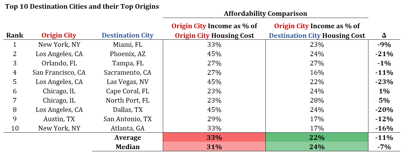
To this point, we’ve been comparing incomes, home prices and rents within cities. We’ll now look at the important dynamic of affordability across cities. Below we show the ten cities which saw the biggest influx of people from June 2020 – July 2021, according to Redfin.com, along with the main origin city of these domestic migrants. We use the same affordability metric as above, the estimated cost of the median home as a percent of the 75th percentile household income. The affordability differences for people moving are striking.
The average housing cost as a percent of the 75th percentile income within the origin cities is 33% while the average cost in the destination cities as a percent of those same incomes is only 22%. In other words, the people in that income bracket who move between these cities potentially save >10% of their income on average by moving, assuming they kept the same income. In some cases such as moving from LA to Dallas, LA to Vegas or LA to Phoenix, the savings are even greater at 20%+ of their income.
While some of these moves over the past couple years were sparked by factors beyond affordability such as the severity of COVID restrictions, there are a few specific cases where affordability seems to be the main driving factor. Look at popular moves like San Francisco to Sacramento and Austin to San Antonio. These are both moves within the state and only about 1.5 hours down the road but result in substantial savings. For example, an Austin income as % of the median Austin home cost is 29%. But an Austin income as percent of the median San Antonio home cost is only 17%. The new, flexible work-from-home environments of many companies has enabled moves like these which historically would have been more difficult, if not impossible, to make.
We believe this cross-city affordability analysis is important because it’s representative of what is actually going on. According to Redfin, 37% of people currently searching for houses in Phoenix don’t live in the city and 23% of them are searching from Los Angeles specifically. For Tampa, the percent of searches from outside of the city is 50%, for San Antonio it’s 44%, Charleston 45%, Las Vegas 44% and for cities like Asheville, North Port and Cape Coral it’s over 66% of all home searches3. While an unfortunate side effect of this is that existing local residents of cities can find themselves priced out of homes, it’s a dynamic in the housing affordability analysis which can’t be ignored.
Need More Supply to Solve the Affordability Issue
Ultimately, we don’t see how the supply/demand imbalance exacerbating home affordability concerns by driving up prices through bidding wars is solved in anyway other than by increasing the supply of homes. Thus, we believe it is key to understand where home builders are building and which markets seemed best positioned to see some welcome relief.
When deciding where to build, home builders prioritize labor force growth & domestic migration. These factors are of course themselves correlated but when you merge them they explain 70% of the variance in new home permits by MSA, independent of any other variables.
Another factor that seems to matter to builders is the percent of population age 35-49. As we’ve discussed in previous articles, the lower end of that age range is where home ownership rates increase significantly.
By combining factors like domestic migration and the age of the population we can group MSAs by their attractiveness to builders and thus estimate which cities should be seeing the greatest improvement in new home supply and price relief. In the top right corner in the “most desirable” quadrant you see many of the cities in the “popular city” group from earlier, cities like Phoenix, Dallas, San Antonio, Raleigh and Las Vegas. Sure enough, go read through public home builders’ commentary and you’ll hear most of them mentioning these areas.
One additional factor is current affordability within an area as measured by the same affordability metric we’ve using. While not as significant as the factors mentioned above it does seem to need to be within 1 standard deviation of average, or within the 17% - 30% range to be attractive for builders. For MSAs within that range there is little preference for builders, however, MSAs outside of that range seem to be penalized. Sure enough, that “popular city” group falls well within this range.
Taken all together, these four factors (net migration, employment growth, population age, and affordability) explain 80% of the variance in the number housing permits issued by MSA. And as you can throughout the charts above, the “popular city” group where it would be most concerning if housing was to become prohibitively unaffordable ranks high on each of these four factors. What does this mean? It means this key group of cities which are still currently affordable, and should be for the most part up until around 7.5% mortgage rates, are also the ones positioned to see the largest increase in new home supply over the next couple years.
Conclusion
While we agree that affordability is something to keep an eye on and quickly becoming a concern in some markets, much of it stems from the supply/demand imbalance we entered 2020 with rather than rampant speculation or anything of the sort. The good news is that homebuilders are building where people want to live, where the demographics support it and where employment is growing. Despite persistent supply chain issues continuing to slow down the pace of completions there are currently more than 800,000 single family home under construction.4 This provides a line of sight to much needed new supply which should serve to help correct the supply/demand imbalance and ease the rapid home price increases in the most in demand cities.


This article was fantastic. I'm a complete novice on housing but it seems like the most important assumption this thesis hinges on is the 20% down payment. I found stat that 48% of homes purchased have 20% or higher as a down payment, but once filtering for first time buyers the % drops to 28%. New home buyers are what we're relying on here, right?
If you changed down payment to say 7-10% to adjust for this, it seems your affordability line gets crossed much quicker.
Great write-up!