We’ve been writing on US housing for several months now, trying to bring a more objective and balanced view using the available data. Real estate related headlines are currently dominated by the question of where home prices are going, and the resulting opinions give a wide range of possibilities, with the vast majority seemingly engendering fear calling for an epic 2008 style crash.
Measures that are often emphasized to highlight the potential downside risks include:
Median home sale price up 36.5% in 2022 Q2 from 2019 Q2
Existing home sales down 5.9% sequentially in July from June
Elevated measures of median home price to median income
30-year fixed-rate mortgage rose to a weekly average of 6.02% on 2022-09-15.
Various macro fears including the looming possibility of a recession, inflation concerns and a struggling stock market.
However, there are just as many reasons that fundamentally explain the home price rise and provide arguments for why home prices in most markets could hold or even continue to rise, albeit at a slower rate:
Wages have risen by 16.1% nationwide in 2022 Q1 since 2019 Q1, and 6.7% year over year.
Employment has now surpassed pre-COVID levels
Remote work has shifted personal preferences and may have caused half of the rise in home prices, according to a working paper by the National Bureau of Economic Research.
New single family home supply is slowing, and the focus is shifting to building multifamily to meet the growing housing demand. New single family home permits were down 11.7% in July 2022 on a seasonally adjusted year-over-year basis, while multifamily unit permits were up 26.2% year over year.
From NAR’s report: "’We're witnessing a housing recession in terms of declining home sales and home building,’ Yun added. ‘However, it's not a recession in home prices. Inventory remains tight and prices continue to rise nationally with nearly 40% of homes still commanding the full list price.’"
Millennials continue to buy their first homes as they now comprise the 26-41 age range in 2022 with a generational cohort roughly 10% (6 to 7 million people) larger than their Gen X predecessors, providing a large source of home buying demand.
A deeper dive into the various demand drivers can be found in our previous article here.
In terms of median home price to median income ratios, in our last post, we showed that while home prices have risen substantially over the past 3 years, home buying is still within reach for many potential home buyers (within the actual home buying income deciles) in most markets, and broad national measures using median home prices and median incomes are flawed. This holds true even if 30-year mortgage rates pass the 6.5% mark.
Nevertheless, many potential homebuyers have surely seemed to move to the sidelines to watch the current volatility settle out. However, there are also signs that home buying interest overall hasn’t lessened. According to a UBS Consumer Labs Research report, “This year search interest increased +1.6% for existing homes (EH) and +22.1% for new homes (NH) from the end of May'22 through Aug'22”.
What Drives Home Prices
With that background, we’re back to the question: where are home prices going and when? Simply looking at a nationwide aggregate requires the consideration of many variables and leads Zillow to forecast a year over year increase of 1.4% while Moody’s sees a 0% up to a -5% decline.
However, the complexity lessens when the question is approached from the MSA level where a few key local market metrics can paint a clear picture of what to expect. Each local market has a unique story that will vary from the nationwide average. We use historic data to set our baseline expectations with Zillow’s ZHVI metric providing reliable approximations for the typical home price in each major market going back to 2008.
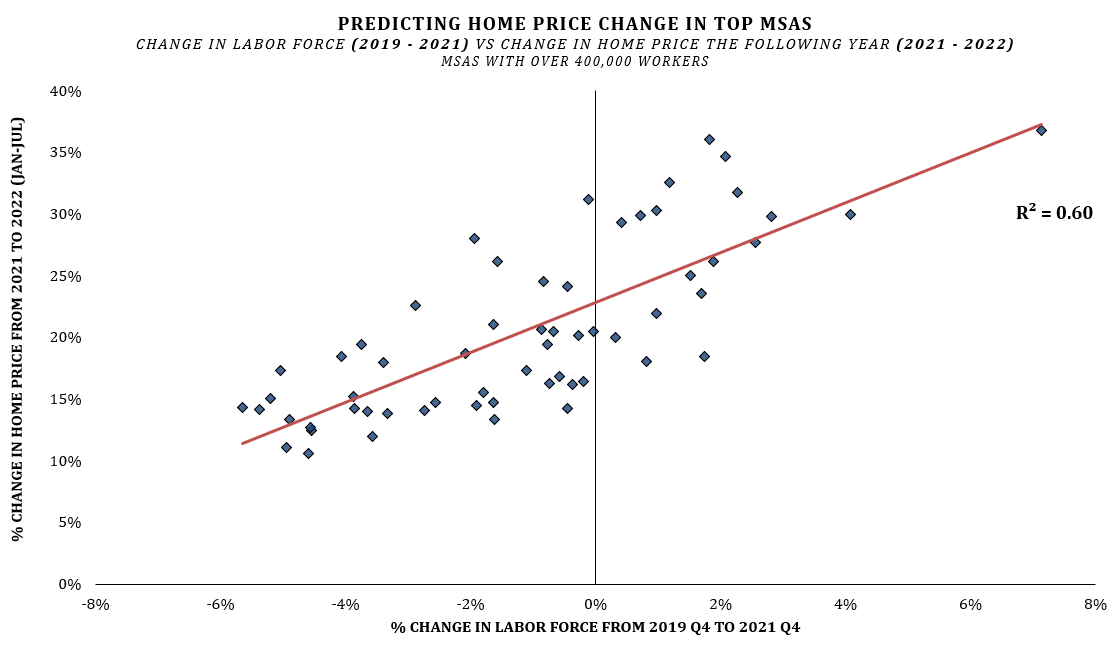
We find that from 2010 to 2019 one variable was the dominant explanatory variable for Y/Y home price change in an MSA: the change in the number of employed people over the previous two years within that market. For example, if you wanted to know how home prices were going to change in a given city from 2015 to 2016, you would want to look at the increase or decrease in the number of people with jobs in that city in 2015 relative to 2013. This one leading indicator predicted 64% of the home price growth variance in markets with over 400,000 workers in a simple linear regression model using data from 2010 - 2019. This size threshold covers markets roughly the size of Tulsa, Oklahoma and larger.
Having one variable that covers 64% of the total variance is huge. After accounting for this 2-year employment growth, other variables such as changes in home supply, demographics, wage growth, etc. all had relevant, but small, impacts when predicting year over year price change. We know that considering all the variables available in a complex, non-linear, multi-variable, model will yield a more complete prediction. However, it’s often beneficial to avoid creating a black box when you have one predictive variable this strong. Focusing effort instead on understanding that one variable while filling in the remaining gaps with expert knowledge is often a better alternative.
In the regression above, we only checked in on the data once per year. An easy way to improve the model would be to also consider rolling 1-year and 90-day employment changes and update the forecasts more frequently. For example, in the 2015-2016 hypothetical, if you were in a given market in early 2016 and your expectations of 2016 home prices were set by strong employment changes from 2013 to 2015, but you then observed the employment situation drastically worsen, you would logically lower your expectations. So, while rolling 2-year employment change is the single most important predictor, when you build out the model and augment it with rolling 1-year and 90-day measures, model predictability improves to ~70%. While we do expect that wages, housing supply, demographics and other similar variables have an impact on prices over longer time horizons, it’s very clearly all about workers in the short term.
How Did This Predictor Hold Up Through Covid?
Putting aside 2020 for a second and looking at 2021, the employment metric works ok, but not as well as it did historically. This makes sense given that the employment was severely impacted by unprecedented factors like shutdowns and restrictions. However, with enhanced unemployment benefits, stimulus checks, paused student loan payments and other government benefits both employed and unemployed individuals kept local economies strong. Taking this into account and adjusting the metric slightly we can look at total labor force instead of employment, where labor force is defined as the number of both employed workers and unemployed workers looking for a job. Historically, changes in the employment count were the better predictor, but both have always been similar. During the COVID years, looking at changes in an MSA’s labor force became the better predictor and showed that the trends discovered pre-COVID held true.
Note that even in markets with 0% change in the labor force, home prices grew ~20%.
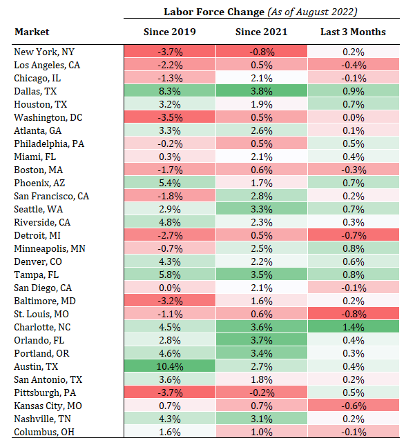
Though many markets will continue to experience home price volatility in the short term, over the next year and beyond we believe that any market currently experiencing strong labor and employment growth trends will see resiliency in home prices while markets with a struggling labor force have serious questions whether current prices can hold. The most obvious way we see widespread nationwide decreases in home prices is if we enter a bad recession and see a broad spike in unemployment across MSAs.
Rent vs Own
The big asterisk here that is true for all statistics is: Past correlations do not necessarily hold true into the future. The key is to identify why past trends are going to break.
First, consider two reasons why home prices recently rose so rapidly:
1) historically low mortgage rates which made homes more affordable to borrowers
2) remote work shifted personal preference and may have accounted for half of the rise in home prices, according to a working paper by the National Bureau of Economic.
Both reasons have reverted to some extent and may continue to backtrack. Mortgage rates are increasing, and more workers are returning to offices as employers and employees look to find a new balance.
Secondly, and we think most importantly over the next few months and year, is the fact that home price growth has far outpaced rental price growth over the past 3 years. This makes renting currently more attractive than it has been in a long time. Consider the ratio Monthly Rent/Monthly Mortgage Services. It’s a metric many households are likely consider to varying degrees of precision before any action. For example, if renting a house cost $2,000 per month and the monthly mortgage, insurance, and tax cost to buy a comparable home was $2,000 per month, the ratio would be 1.0. If rent was instead $1,000/month, and the mortgage servicing cost was $2,000 the ratio would be 0.5. Historically there has been some natural equilibrium to this metric for each MSA but now, in nearly every market we’ve looked at, the current rent/own ratio is far from the historic norm.
Using Austin, Texas as a case study, we constructed this metric using both Zillow data (ZHVI and ZORI) and MLS data. MLS data is more exact and allows for apples-to-apples comparisons. The parameters we set were home sales and rents where the home was a 3 bed, 2 bath, with lot sizes of 4,000 - 15,000 sq ft and home sizes in the 1,200 - 2,000 sq ft range. Notice that while the graphic below is dual axis as we are using two different data sources the shapes of the data are the same, confirming the trends. The lower the ratio is, the more favorable renting is and the higher the ratio is, the more favorable it is to buy.
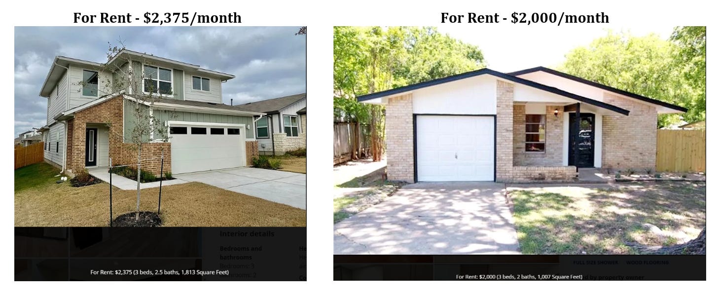
Continuing with Austin as our example, below are three homes. The first for sale and the next two are for rent. All three houses are in northern Austin neighborhoods and are less than a 10-minute drive from each other. All are 3 beds, 2 baths and under 2,000 sq ft. The house for sale ($570,000) is in a slightly better neighborhood. The first house for rent is a little larger. The estimated monthly total mortgage services payment for the house for sale is ~$3,900 with a 20% down payment. The larger house for rent is $2,375 per month. That's a $18,000+ per year choice for the household who may have an income around $150,000 pre-tax. The second for rent house is even less at $2,000/month, saving an additional $4,500 per year.
Some households will choose to buy no matter what because there are definite benefits to homeownership, but others will see that larger rental property and having extra $18,000 at their disposal as the better choice for them. While they aren’t building wealth through homeownership, they can use that money for something else and any home repairs needed are not their financial responsibility. They also have greater choice and flexibility to move in the future and can continue to search for the right house on their terms.
Seeing that the Zillow data works well to highlight the underlying trends we can look across many more markets and the U.S. as a whole. In the graphic below we see that each MSA has its own natural equilibrium in the rent/own ratio, e.g., cities like LA are also much more attractive to rent. We also see that all the major markets have followed similar trends over time including the large and quick increase in the attractiveness of renting from summer 2021 to summer 2022.
How does this rent/own ratio effect available supply? In markets where renting is currently more attractive relative to its pre-covid baseline, we are seeing a faster increase in available home inventory using Realtor.com data. This increase in available homes takes the advantage away from the sellers and gives it to the buyers, putting lots of downward pressure on home prices.
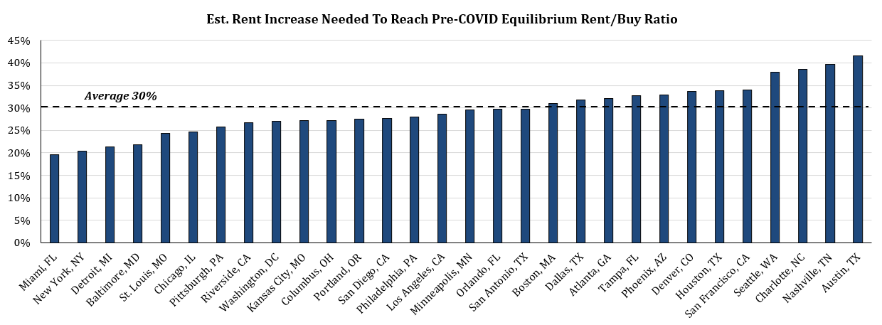
For this ratio to come back into balance without a drastic change to mortgage rates, it requires either rents to rise or for home prices to fall. In reality, it will likely be a combination of both, which is already occurring. Using Zillow data through August we’re seeing a rapid upward shift in the rent/own ratio has begun as home prices have started to dip a little in some expensive markets and rents are continuing to rise just about everywhere.
It is important to note that this ratio does fluctuate over time. With the major increase in remote work, quickly increasing demand and slowly increasing supply, it’s very plausible that this ratio going forward will not go back to the 2019 levels (without a deep recession). It’s possible that the new equilibrium for a given MSA will be somewhere between where this ratio is now and where it was pre-COVID. However, there is one caveat, if 30-year mortgage rates were to drop back under 4%, this imbalance would largely evaporate with most MSAs quickly returning to their pre-COVID baseline.
We estimate rent in the top MSAs needs to rise an average of 30% to return to its pre-COVID equilibrium, holding current rates and home prices steady
Conclusion
The vast majority of recent housing related headlines are pure doom and gloom, but as with most things in markets and life, nothing is black and white, nothing is all positive or all negative. Job growth remains robust, new housing inventory growth has slowed to a trickle or stopped altogether, and consumer balance sheets are still just about their strongest in modern history1. Furthermore, the demographic tailwinds remain powerful as surveys reveal that a vast majority of young people that don’t already own a home are still waiting for a price dip to buy2. The housing exposure in our portfolio remains almost entirely geared towards Repair & Remodel spending, which is demonstrating remarkable resilience the last few months which we believe is poised to continue.


Thanks for this great newsletter; I always enjoy reading it.
I thank you as well